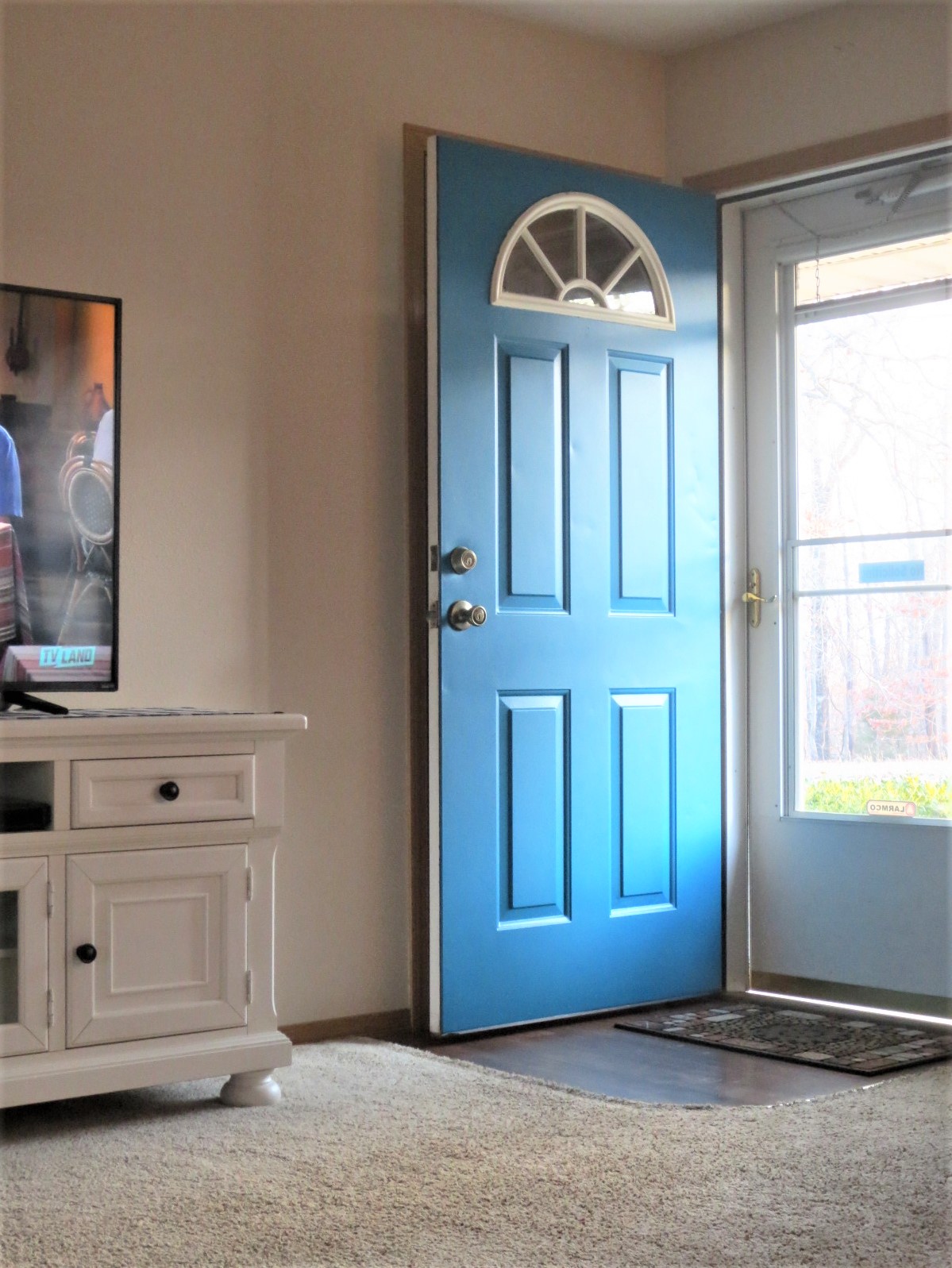
Thursday, May 16, 2013

OLIOBOARD...

Hey, how you doin'?  Are you enjoying this fabulous spring weather we have been having.  I am sooooo loving it!

So as you may have heard, we bought some red furniture last week. Admittedly I have been all up in the air about designing my living room around it.  I have never owned ANYTHING red in the way of furniture.  Truthfully, it intimidates me.  It's so bold and so in your face, right? Well, as I mentioned the other day, I turned to Olioboard for a little direction in designing my living room while incorporating my new red furniture.

I heard about Olioboard a long time ago from Rhoda at Southern Hospitality but had never tried it until the other day.   Now I am addicted...IT'S SOOOOO MUCH FUN!!!  It might even be MORE fun than Pinterest...doh, did I really just say that!

In case you have never heard about Olioboard, Olioboard is a free site where you can choose from tons of room backgrounds, furnishings, rugs, fabrics, wallpapers, accessories, etc. to help you design a room in your own style.  You can switch things out until you get the look you want.  I like that idea because for me it means that I won't be randomly buying things and then returning them later because they didn't "WORK" for me.  I can get the full picture of what I want before I buy. It gives me a design game plan and I like that. Besides, like I said...it's just plain right down fun!  Think of it as paper dolls for grown ups only instead of a doll, it's a room and instead of clothes, it's decor.

Now since I have been trying to come up with a game plan of incorporating my new red furniture into my living room and come up with something I can live with, I have designed several rooms using the same two pieces of furniture...A red sofa (the exact one I have) and a tan chair (similar to the recliner we purchased with our red sofa and loveseat) but switching out pillows, rugs, curtains and accessories in each.  Wow, it's totaling amazing the different looks you can get using the same furniture!

Now my problem is that I love all of them and don't know which look I want to use.

Maybe you can help.  Which one do you like?

Contemporary living room 2

In this first one I used a mixture of metals to go along with my existing brass accents.  I also added in a little navy blue, which I love and some animal print, which I also love.

Pattern & Color living room
This one is probably the boldest mixture of color and pattern, but I really like it.  It's bold and alive and has lot of movement.  Very casual and comfortable.

a little bit tropical
Again this one has lots of animal print (which I absolutely adore) and a nice bright green for an accent color.  I love it too.  I love the rug, the curtains and that awesome crab picture.  The seagrass ottoman is great too.

Coastal with Red and Blue

Now we all know that red and navy play so well together so I added a ton of navy in this one.  It's kind of nautical don't you think?  I love it!

Well as I said, I am in a quandary of which design I like best because truthfully I love them all.  Maybe you could help me choose.  Leave me a comment on which one you like best, and...

Do yourself a favor...go to Olioboard and have some fun today.   You deserve it!


Monday, May 13, 2013

WHEN THINGS DON'T QUITE GO AS PLANNED...

So, I had a vision for my living and dining room redo.  I had planned on Revere Pewter walls as a backdrop for my beautiful drop cloth covered furniture, wonderful modern trellis, chevron or striped area rugs, perhaps adding a few coastal elements and some brass accents...ya know, since brass is back in style and I already have some lovely aged brass in my home due to it's historic age and all.

Sadly that vision was thwarted thanks to dear ol' hubby.  He said NO to gray walls!  He said gray is too institutional, cold and industrial.  I said oh no, no, no, gray is so sophisticated, warm and friendly now.  I even showed him my painted samples of the lovely Revere Pewter I had picked out, but he said NO and that's final.  What a meany!  He wanted beige, the beige buckhorn by Colorplace that was in the dining room...and since we had plenty of it leftover, that's what he got.  Yes, I am a nice, loving and accommodating good wife like that.  Admittedly I like it.

After saying no to the gray walls he also downed my drop cloth furniture.  He politely said, "I think you did a great job recovering the loveseat in that drop cloth fabric and I know you have plans to recover the sofa too, but I really think it's time we get new furniture...We need something darker.  I was like darker....No......and then we went furniture shopping.

On the way there all I could think about is what type and color should I choose.  Waaaa, I don't know what to do.  He completely ruined my plans.  Then it hit me, how about gray furniture.  Yes, that would be perfect...only they didn't have any gray furniture that I liked.     Waaaaaaa!!!

In the whole store they only had two sets of furniture that either of us liked.

They had this lovely light tan, NEUTRAL set that I liked:


and they had this lovely RED set that he liked.


Guess which set we got...come on, guess....Yep, we got the RED.

I was leaning toward the tan because it's neutral and not so in your face, but he LOVED the RED!  His argument, "the tan is too light.  It won't hold up to dirt and stains good enough."  So, once again I conceded.  I know, I'm just so nice like that.  I'm such a good wife, right?

It actually is very beautiful and looks great with our new beige walls.  But what about my design plans?  They went by the way side and now what in the world am I going to do with these beige walls and red furniture that I was totally NOT anticipating?

What do I want in the way of curtains, an area rug, yada, yada, yada.

So guess what I did (after I called the furniture store only to find out that it would cost me $125.00 for them to come get the red set and exchange it with the tan set), I did what any self respecting woman, who is not paying $125.00 to some ridiculous furniture store would do, I put together a little Olioboard to help me achieve the right look for my room.  This is what I came up with...


What do you think?  I added a lot of golden beige tones to counteract some of the red and I think I am going to like it.  The hounds tooth area rug is to die for.  I can't wait to get it all lined out.

So now you know what happens at Beyond the Portico when things don't quite go as planned...YOU GO TO PLAN B!!!  Whatever that happens to be, hahaha.

I hope to be back soon with some updates and pictures.  Until then, ciao.


Tuesday, April 16, 2013

MY QUESTION ANSWERED...

Have you all ever heard of C.B.I.D Home Decor and Design.  If you haven't, you must check it out.  It is a color consulting, home decorating, and design arts blog that offers FREE professional online design advice to the design challenged....or even to those who are just a little stumped in some particular area, such as myself as of late.

I have been completely frustrated over choosing paint colors for my living room and dining room.  Normally I do not have trouble in this area, but then again we have pretty much always had an open concept home.  You can pretty much throw up any paint color you want in a large open, naturally lit space and it's gonna look great.  Not so much though in a home with small west facing rooms that receive little natural light.


I have had multiple paint swatches stuck to the walls for over a year.  I have bought a few samples and painted poster board sized swatches and hung them on the walls too.  Truly, I have had a major headache over trying to choose a paint color that is fresh, clean, modern, light and bright enough for these rooms.   I truly have been at the point of just surrendering and painting EVERY.LITTLE.THING WHITE.  Enough already, right!!  Okay, I admit I needed help!


A month or so ago I stumbled across C.B.I.D. and I am so glad I did.  I took the chance to send a few photos of my problem rooms and ask for some color consultation.  I wasn't sure if I would get an answer but took the chance anyway.  The answer came today.  Yahoooooo.

I am totally thrilled with the suggestions and advice I received.  She posted my photos and question and then suggested some very nice paint colors.  She also attached photos of beautiful rooms sporting the suggested colors so that I could see what the color looks like in an actual room.  You can check out her post and her suggestions to me HERE.  I know you are just going to love C.B.I.D. and if the truth be known, you might even find yourself asking for some advice of your own.

Titanium by Ben Moore

I will hopefully be picking up some samples of her suggestions this weekend to see if one of the choices will finally put an end to my frustration.

Wish me luck!  


LinkWithin

Related Posts Plugin for WordPress, Blogger...
Blogging tips