Thursday, September 27, 2012

MY NEW FAVORITE FALL TREAT...

I'm a little (okay A LOT) behind this year.  I haven't done any fall decorating this year nor have I done any fall posts this year.  You all are WAY ahead of me but here goes, my first fall post of the year albeit short and sweet...literally....

Okay, I have to admit that I am a real foodie...especially a junk food foodie....hahaha.  Give me some junk food (well just about any food EXCEPT liver) and I'll be your best friend.  I love food and it shows...in all this extra weight I carry around.  Okay, okay.  I admit I am NOT a health nut.  My bad!!

Anyway, let me get to the purpose of this post.  I love to try neat foods especially around the holidays.  Last year my favorite fall treat was hallowing out apples and using them as cider mugs...see


Aren't they adorable?  Yes, yes they are!

This year I just spotted my new favorite fall treat in the Country Living Magazine.


S'mores candied apples. YUMMMMMM!  Ingenious!!  I will being making some of these soon.  Perhaps for bubs' birthday coming up here in a few short weeks.

If you would like to make some of these too (think fall festivals and get togethers) go HERE to get all the details.  HAPPY FALL Y'ALL!!!

Sharing at:
Imparting Grace
2805
Coastal Charm
From My Front Porch To Yours


Thursday, September 20, 2012

IMPRESSED...AND MY #1 PAINTING TIP

Happy fall everybody!!

Looky what I received in the mail today...


I was checking out the Farrow & Ball website browsing through their paint colors and found a few that I was interested in so I decided to request a free color card from them.  I thought that I would just be getting a few small color chips, you know like the ones you get from the local paint stores, but instead I got...


a booklet with their complete line of paint colors ("colours" as they spell it...so swank, right!) and I also received a full color catalog with examples of their colors used in rooms, color combinations, design and decor ideas, tips and hints.


I received all of this at no charge.  That's right, they didn't even charge shipping.  Let's just say I am very impressed by their service.  I simply filled in my information on their easy to use online form and in about a week I received all of this *FREE*.

Farrow & Ball also sells beautiful wallpaper and you can receive all the samples you want of those for free as well.  You know, just in case your interested in a few freebies.

St Germain

To order samples click here... http://us.farrow-ball.com/samples/content/fcp-content

I will probably be ordering a few myself.  Just haven't decided which ones yet.  I will keep you informed...PROMISE!

On another note, I do want to say that the two colors I was interested in trying "Vert de Terre" and "Light Blue" show very differently on the actual color chip than online.  "Vert de terre" was pretty accurate but a little darker than I expected and "Light Blue" does not appear to be light blue AT ALL.  There is nothing "light" about it.  It is a mid to deep tone gray with perhaps a hint of blue.

First row top:  Vert de Terre
Second row near bottom:  Light Blue

Over all they were way darker than I expected and though both are very beautiful colors I will most likely not be choosing either of them for my home.  I am looking for something much lighter and fresher.  "Skylight" on the other hand (3rd row, third from top) (looks kind of minty here, but is not) may just be the blue gray I am looking for. We'll see.

Anyway, I said all of that to say this...that things (especially paint colors) aren't always what they seem so don't make any rash decisions on color based on rooms you've seen online or on paint swatches.  Always, always test first.  Get yourself some sample pots and try a few before making a decision as to which one you like best.  All colors will look differently in different rooms and settings so test, test, test!!!  Take this from someone who up until recently painted rooms simply by just selecting a pretty paint chip, purchasing lots of paint, painting entire rooms with two coats, only to repaint again and again (or worse having to live with the horrible color until I could afford to paint again) all because I got the "wrong" color the first time.

So there you have it, my #1 painting tip....TEST, TEST, TEST!! End of story, end of painting woes!


Friday, September 7, 2012

BEST PAINT TOOL ON THE WEB...

Hello all!!!

Although I have not mentioned it much at this point, I am contemplating repainting my living room, dining room and kitchen in cooler, lighter colors.  Of course that will come after we get the houses exterior painted!!  

Anyway, I am looking at some bluish grays and grayish greens for a soothing, peaceful and calming effect.  Currently most of my main floor living is tan and taupe.  Can I just say...I AM NOT A TAN, BEIGE or TAUPE kind of person....nuff said?

Anyway, I have been googling paint colors in the blue and green families and I have come across a few I am in love with and I think I might want to use one or two of them.  I found this beautiful blue gray called "Pale Smoke" by Ben Moore.  It was featured in Katie Lee Joel's NY City apartment which was designed by Nate Berkus...

Katie Lee Joel's living room

Gorgeous huh?  If Nate Berkus used this color you can bet it's a winner!

This next room is also in Ben Moore "Pale Smoke"


I love it.  I absolutely love this color.  It's a barely there blue/gray that is just so soothing and peaceful.  Just the atmosphere I am wanting to achieve in my home.

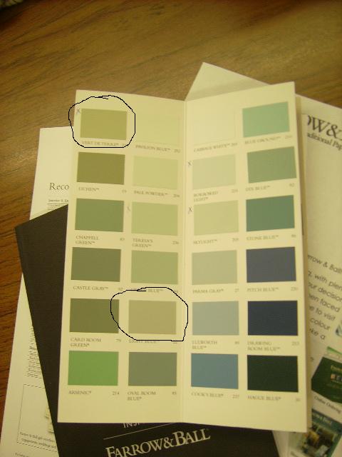
I have also been looking at Farrow & Ball's "Light Blue" and a sage green of theirs called "Vert De Terre"


These are perfectly coordinated colors and I am in love with both of them.  Problem is there is no Farrow & Ball dealer in my neck of the woods and the only Ben Moore stocker is 30 miles from home.  Lowes is much closer and that brings me to the subject of this post...THE BEST PAINT TOOL ON THE WEB.

There is an online paint tool colorcharts.org that can give you an alternate brand match to any color you want.  Using this tool I found out that Valspar's "Woodlawn Sterling"  is a match to Benjamin Moore's "Pale Smoke"...

I also found out that Valspar's "Frosty Glass" is a match for Farrow & Ball's "Teresa's Green" another gorgeous color I have been eyeing...

F&B Teresa's Green


I found matches to Farrow & Ball's Light Blue and Vert De Terre as well.

Sherwin Williams's "Magnetic Gray" is a match to F&B's  "Light Blue" and Behr's "Restful" is a match to F&B's "Vert De Terre".


You really must check this tool out!!  I know you will benefit from it greatly.

Here's how it works....

Go to their site colorcharts.org, type in the name of the paint color you want to match.  It will show you the brand name and swatch of the color that you chose.  Next, click on the "match" button.  A list will appear with the closest match for that color in every brand that carries a match or close match.  Did that make sense?

What that means is...if you have a favorite Farrow & Ball color, you might be able to get the same or close color in a different brand and at a store that is closer to home.  This alone can save you time and money.  You will not be traveling a million miles from home to a store that carries a particular brand of paint. You can have easier access to paint samples.  You will not have to order paint online or pay outrageous shipping charges and you will not have to wait days for your paint to arrive.

This tool has already been a great help to me.  The closest Farrow & Ball stockist is 85 miles from my home.  I can get the Valspar samples to match Teresa's Green and Pale Smoke right here in town.  I can also get the Sherwin Williams sample to match Light Blue here in town.  I will not have to pay shipping charges.  I will not have to travel or order online and I will not have to wait for my samples to come in the mail. I'm so excited!!!

Anyway, it's a super cool tool.  I hope you will go over and have a look. It's absolutely fabulous!!


Blogging tips