
Looky what I received in the mail today...

I was checking out the Farrow & Ball website browsing through their paint colors and found a few that I was interested in so I decided to request a free color card from them. I thought that I would just be getting a few small color chips, you know like the ones you get from the local paint stores, but instead I got...

a booklet with their complete line of paint colors ("colours" as they spell it...so swank, right!) and I also received a full color catalog with examples of their colors used in rooms, color combinations, design and decor ideas, tips and hints.


I received all of this at no charge. That's right, they didn't even charge shipping. Let's just say I am very impressed by their service. I simply filled in my information on their easy to use online form and in about a week I received all of this *FREE*.
Farrow & Ball also sells beautiful wallpaper and you can receive all the samples you want of those for free as well. You know, just in case your interested in a few freebies.

To order samples click here... http://us.farrow-ball.com/samples/content/fcp-content
I will probably be ordering a few myself. Just haven't decided which ones yet. I will keep you informed...PROMISE!
On another note, I do want to say that the two colors I was interested in trying "Vert de Terre" and "Light Blue" show very differently on the actual color chip than online. "Vert de terre" was pretty accurate but a little darker than I expected and "Light Blue" does not appear to be light blue AT ALL. There is nothing "light" about it. It is a mid to deep tone gray with perhaps a hint of blue.
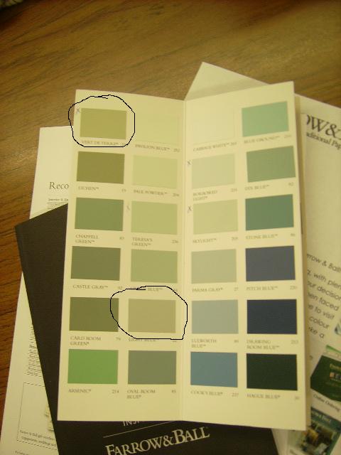 |
| First row top: Vert de Terre Second row near bottom: Light Blue |
Over all they were way darker than I expected and though both are very beautiful colors I will most likely not be choosing either of them for my home. I am looking for something much lighter and fresher. "Skylight" on the other hand (3rd row, third from top) (looks kind of minty here, but is not) may just be the blue gray I am looking for. We'll see.
Anyway, I said all of that to say this...that things (especially paint colors) aren't always what they seem so don't make any rash decisions on color based on rooms you've seen online or on paint swatches. Always, always test first. Get yourself some sample pots and try a few before making a decision as to which one you like best. All colors will look differently in different rooms and settings so test, test, test!!! Take this from someone who up until recently painted rooms simply by just selecting a pretty paint chip, purchasing lots of paint, painting entire rooms with two coats, only to repaint again and again (or worse having to live with the horrible color until I could afford to paint again) all because I got the "wrong" color the first time.
So there you have it, my #1 painting tip....TEST, TEST, TEST!! End of story, end of painting woes!


Hi Sheila,
ReplyDeleteThanks for visiting and leaving your comment. I read that you are getting ready to paint several rooms and are selecting your paint colors. Have you ever visited this blog? http://www.favoritepaintcolorsblog.com/
You can see rooms painted in specific colors. Looking forward to seeing what colors you choose.
Too funny. I just ordered a "colour" card from F&B last night. I'm thinking about using their paints in our new hallway project. Pricey though, huh? I do hear it is worth every penny...
ReplyDelete